Data Visualization Before Machine Learning
- Data viz , Machine learning
- November 28, 2021
Do you ever ask yourself why your machine learning model isn’t used? Why do so few people really believe in the power of machine learning rather than these old dashboards?
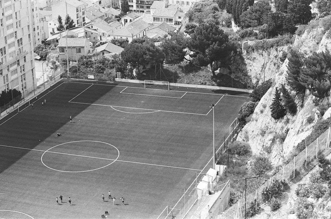
When I was working in a football club , I made a data visualization showing player performances during the season. It was a really simple tile plot . But when football people saw it on my screen they engaged quite quickly. They asked specific questions; if it will be possible to get this chart regularly, etc…
This plot drove much more engagement than any machine learning models I had made since there. It’s much easier for non-tech people to ask questions on charts rather than on a machine learning model.
Let’s see how we can bypass a machine learning project with data visualization.
The problem with machine learning
Machine learning is very powerful. It can resolve complex problems better than any human.
Still, it has many issues.
Firstly it’s hard to implement. Today, they are a lot of tools to develop, orchestrate, deploy and monitor machine learning models. But the coordination needed to make a project successful is still significant.
A real machine learning project is not a single data scientist doing some obscure data manipulations in a notebook. You have to scope the project with business people, understand the use case, anticipate edge cases, have a vision of the deployment and the monitoring of your model.
All of this means coordination between people from different horizons. Hard thing.
This is not the only issue.
Getting clean and good data for your problem is always the hardest part.
Doing the proof of concept in the notebook seems easy. But when you will have to design your system to make it works in a production state you will face many headaches.
Collecting standardized data in the long term is difficult. You have to monitor your features to prevent any drift in distribution. You have to know the sources of the data and the possible bias behind their collection. Most of the time, any of these assets don’t have real-time feedback loops.
Even if your data orchestration is well set up, you will have to deal with more focused machine learning tasks:
- Find a good model for the corresponding problem.
- Find a trade-off between model performances and predictions explainability.
- Model your data to extract good features.
- Shape your data according to the volume and your environment resources.

Putting in production all this stuff asks for many resources on the IT side. Depending on the size of your company you will have to deal with software, system engineers, security policies, business reviews, etc…
The tech stack is complicated, and almost nobody is an expert on the end-to-end pipeline.
In the end, you understand why stakeholders have to really believe in data-driven problem resolution. Any machine learning project — from start to end — needs weeks or months of development before reaching a state actually useful for the company.
The first rule of any machine learning project: don’t do machine learning.
Another choice: data visualization
We often overlook machine learning.
Most machine learning projects are made to forecast trends or KPIs and take decisions. The other tools overlooked to take decisions are dashboards. So-called “data-driven” decision.
Dashboards are not so useful to make decisions but to explore data .
When talking about data visualization I refer to static graphics or interactives embedded in bigger story-telling projects.
These ones can really drive decisions.
Firstly, they are “easy” to create.
Before beginning any chart you often have a great idea of its finality. What the end-user wants to know through this chart? What do you want to highlight?
The data visualization product has clearer bounds.
Contrary to machine learning projects, a data visualization doesn’t rely on a big technical stack.
No performance benchmarks. No so much complex data modeling. No monitoring. No system engineers, data security policies, etc…
The process to find a good data visualization is much more linear: you have an idea, test, and/or discuss it with end-users, you iterate, then release.
It’s much more static than the machine learning process.
By design, a graphic is made to drive audience engagement and show data in the most simple way: decisions are then easier to take.
What tools can I use?
The one you prefer!
In reality, there are a lot of possibilities to create data visualization: GUI software (Microsoft Excel ), programming languages (R with ggplot , Python, D3.js ), design tools (Adobe Illustrator/Photoshop , Figma ), etc…
How to make create data visualization?
Good question. By design, a good chart is the one your audience will engage with. Choose colors, design, and complexity accordingly. Go to simple things first, then iterate if needed.
Looking for inspirations? Here are masters and thoughtful publications :
- Cedric Scherer — Data Vizualisation Specialist
- Duncan Geer — Information Designer
- Alberto Cairo — Journalist and designer
- Nightingale — Journal of the data visualization society
- Elevate membership — Level up your data visualization skill
- Info We Trust — How to inspire the world with data
Machine Learning or Data Visualization?
So you’re in a data team and your role is to drive decisions. The data way.
Stop your dashboard, your notebook , or your model training.
Next time someone is asking for a data-driven decision: ask yourself why a data visualization would not work? It might be.