Beyond the Goal: Visualizing Expected Assists in Soccer
- Data viz , Football
- October 15, 2019
Basketball games have score lines in the triple digits. An NFL game in 2019 might produce a combined double-digit touchdowns. However, in a low-scoring game such as football (not the NFL, rather, what North American fans know as soccer), the final score often does not provide a clear picture of performance.
Some of the most exciting and intense games will end with no goals but nevertheless a lot of breathless action and numerous shot attempts. Similarly, some analysts will discuss how the winning team was not the best on the pitch, and that the other team was very unlucky. So how can we bridge that gap and capture the process, not simply the results? This is why more and more modern football analysis is based around the concept of expected goals: a statistical measure of the quality of chances created and conceded.
Thanks to the advent of machine learning, we can estimate the probability of how likely a shot is to end in a goal. Based on volumes of historic shot data, this kind of model relies on several intuitive features such as shot location, previous event type and position, point in time of the game, distance from goal, and much more. Opta, a leader in soccer data, released a really good explainer video on the fundamentals of the expected goals metric.

The focus of this piece is not on expected goals, though. In this piece, we will explore a derivative idea instead: the expected assist. Like the former, expected assist is a metric that estimates the likelihood of a pass turning into an assist. So, many of the features are similar to modeling shots but just translated to passes: pass position, previous event, etc. And rather than the process to compute such a metric, we will also see how it can be summarized and highlighted thanks to data visualization.
From expected goals to expected assists
In the same way that goals aren’t the end-all, be-all, assists are a pretty decent starting point to measure a player’s passing, but they do not necessarily reflect the quality of chance created.
For example, a player could make four very good attacking passes, but none of them may end up being converted by his teammates. At the opposite end of the spectrum, a player may be rewarded with an assist just for passing the ball to a teammate striking a very low-probability shot from outside the box.
Expected assists, then, provide a deeper level of insight into each situation and allow the player who made the pass to be assigned a more appropriate level of credit for that pass regardless of what happens to the ball from that point onwards. Indeed, every single completed pass that a player makes during the game has an expected assist value to it. As you might expect, most will be extremely low (scoring is difficult, after all!). But this enables greater credit for those passes that progress the attack — for example, the pass before the so-called key pass.
I’ve written previously about mapping passes in football. After the pass networks and pass sonar we explored in a preceding piece , the natural extension is quantifying the value of those passes. And so I’ve built more maps to visualize that value.
As a quick aside, football is at its core a sport of position and space. Legend has it that FC Barcelona were able to play with a bigger field to favor their meticulous possession game back in the day (thankfully, most of the playing fields in Europe today have been standardized to 105 meters x 68 meters).
With that idea of position and space being so critical, it’s no wonder that maps are a highly effective visualization tool in football analysis, which is why I continue to leverage them as a medium.

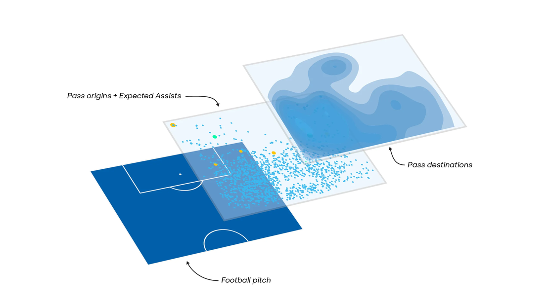
The above is my take on an expected assist (xA) map. As we can see in the bottom right legend, there are different levels of information embedded in this map that we ought to unpack. The individual dots represent all player passes, and they are sized by their expected assist value. To facilitate the analysis of xA, we highlight in yellow the passes with xA value greater than 10 percent. Passes that actually did turn into assists are colored in green. On the other hand, you may also have noticed a heat map that levels highlight the density of a player’s pass destinations.
Combining these two layers on a football pitch gives us a really cool graphic (if I may say so myself) to explore both how and where a player can deliver passes as well as their respective xA values.

A brief word on the technical process: I make these plots using ggplot2 in R. My expected assists model that these visualizations are leverageing is created using Python and its scikit-learn library . I have gotten fairly solid results with the random forest algorithm trained on four years of historic Premier League data.
As with my previous pass maps, I kept the blue background inspired by a building blueprint. Since there are many points to display on one map, I chose a subtle light blue for the common passes and different brightly contrasted colors for assists and high xA value passes. Along the same path, so as not to be “disruptive” to the whole graphic, the heat map layer also follows a soft blue color range.
Using the xA maps to analyze different players
Let’s begin with a simple one. When Bernardo Silva came to Manchester City in 2017 from AS Monaco, they were some doubts about the playing time he would potentially receive. With a lot of good offensive players, Manchester City were already stacked in these positions. But that did not count on the creativity of Pep Guardiola and his staff: while Bernardo Silva can play all over the attack, they chose to give him time on right wing. Now regularly in the starting eleven, we can see how a large portion of his moves and passes come from this side of the pitch.

We have a similar map with Mateo Kovacic. Though he evolved into a freer role in Chelsea’s squad, his map shows how he stays on the left with short passes. Thus, we can easily understand critics’ concerns about his lack of decisive action that opened up defenses, something Chelsea fans were expecting when the Croatian came over in 2018.

These above two maps also serve to highlight how manager tactics can determine the way players progress about the pitch. In fact, just plotting passes origins and destinations can underline special tactic directives. Things get even more interesting when looking at playmakers in a pivot position.
While Christian Eriksen often plays from a free role in the midfield, he often comes up from the right wing. His 2018–19 map below demonstrates many things. Firstly, we can appreciate how he is free on the pitch with pass origins and destinations covering the full width from sideline to sideline. In addition, it highlights why he is a such an interesting and talented player: most of his passes arrive on the left side but we can observe that right hand side sector in the final area pointing out his involvement to deliver breakthrough passes. The xA values are also telling: he recorded 12 assists while the cumulative expected assists pegged him for around six.

These maps are also illustrative with forward players. For Roberto Firmino, it demonstrates how the Brazilian is playing in a more playmaking center forward role. With Sadio Mane and Mo Salah on the two sides, Firmino holds up play, opting to give the ball to his fast teammates on the wings.

When juxtaposed against the passing network for one of his games against Chelsea last season, we can fully grasp how Liverpool’s manager, Jurgen Klopp, has designed the offense to revolve around the scoring of his stars on the wings, rather than more traditionally funneling towards the center forward or striker (Firmino in this case).

Ultimately, Expected Assists maps allow us to summarize and place added emphasis on a key component of football: passes. More than just bringing forth a new metric, they can reveal a lot about how a player is positioned on the pitch and where he prefers to pass as well. With much more passing events than shot attempts in a soccer game, this unlocks a lot of information about the match. We could push the concept further by looking at xA maps for a whole team or even looking at conceded assists to determine where the gaps are in a team’s defense. And we didn’t focus on expected goals in this piece, but we can do this kind of map for shots too .
That’s all on expected assists for now. I hope you were able to learn more about another frontier of football visualization as we continue to explore the value of passing, and please don’t hesitate to connect with me on Twitter or leave a comment below if you have any thoughts!